


Role:
UX Researcher, UI/UX Designer
Team:
MSU UX Design Graduate Students (4)
Duration:
~ 4-5 months
Michigan Bass Nation is a non-profit organization that connects adult and youth anglers to bass fishing tournaments and programs across the state. However, their existing websites were outdated, hard to navigate, and missing essential information. Our team of graduate students was tasked with redesigning both the adult and youth sites to deliver a more modern, user-friendly, and informative experience for anglers, parents, coaches, and new members.
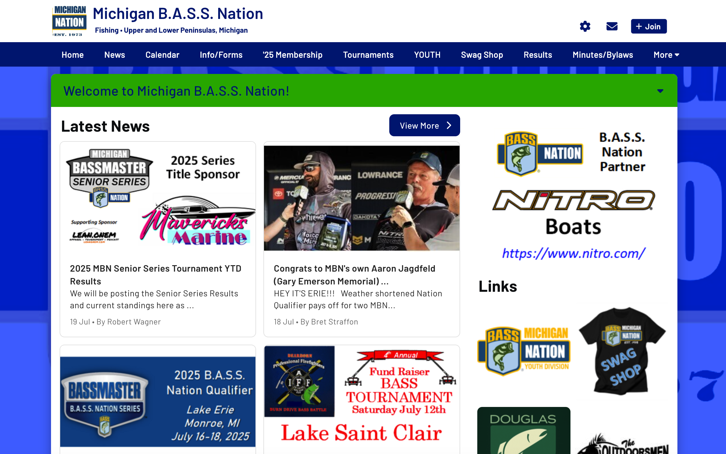
Current homepage
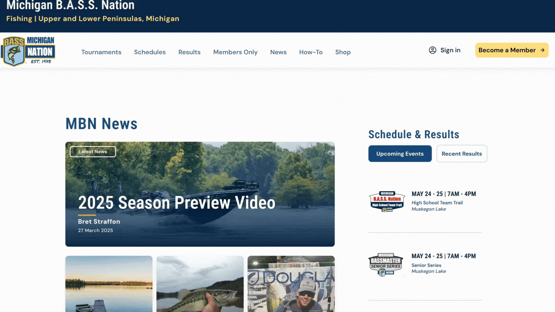
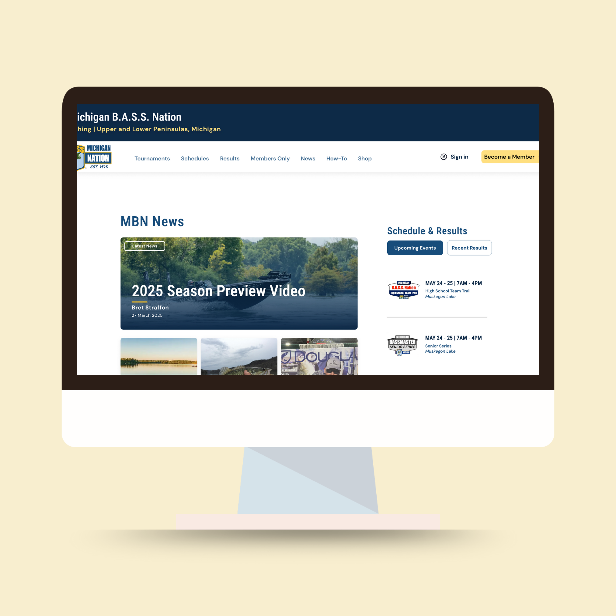
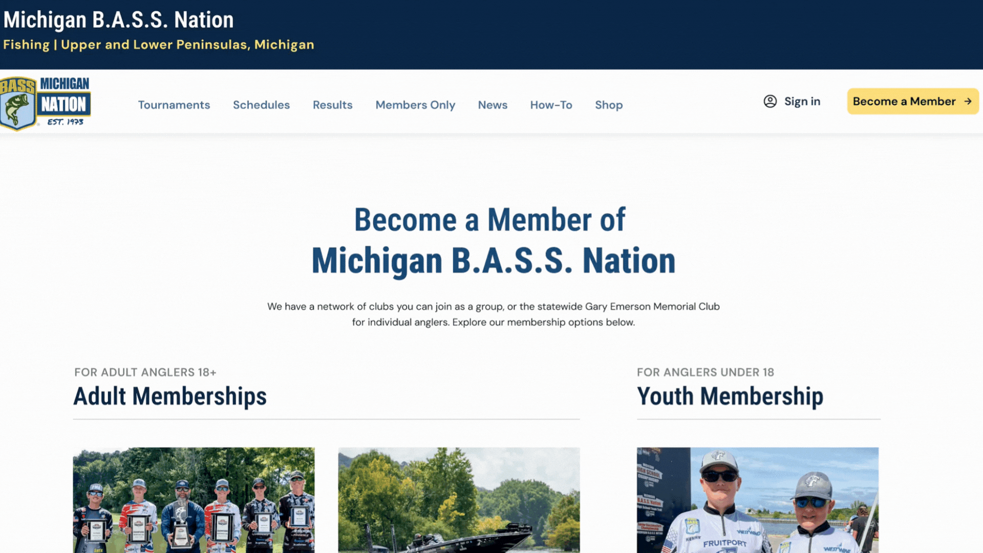
Redesigned homepage
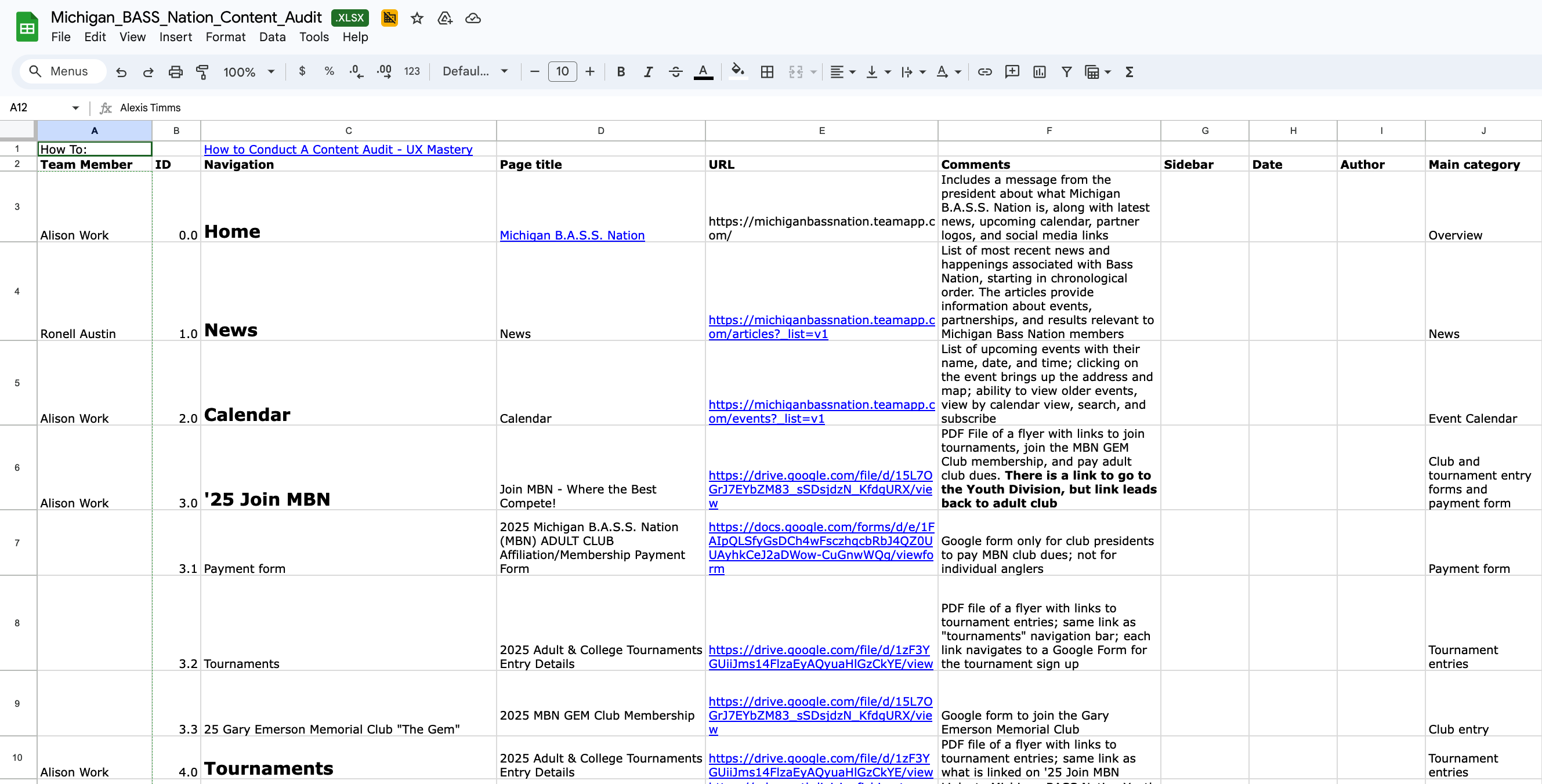
We conducted a full content audit of both the adult and youth websites to better understand what content was included within the website and how it was organized.
After our initial stakeholder meeting, we sent a follow-up survey to both the adult and youth program directors to gather insights on target audiences, top priorities, current challenges with site functionality and content management, essential features, and preferences regarding the separation of the adult and youth websites.
From these surveys, we learned the following goals and pain points:
We then conducted user interviews and card sorting exercises to better understand how users felt the information on the MBN Adult & Youth websites should be organized, along with four expert reviews. This research helped us understand key user tasks and navigation patterns, which informed the development of a more user-centered information architecture.
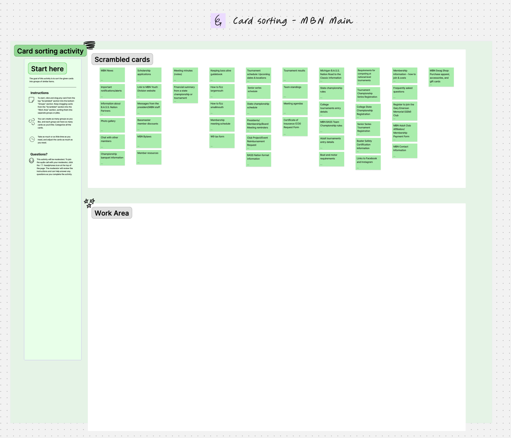
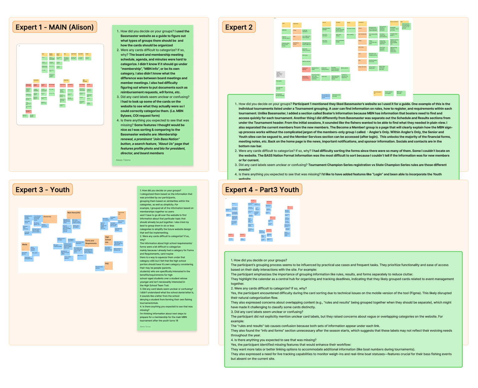
After synthesizing information from the card sorting activities and our expert reviews, we met as a team to reorganize the content and create a new site map. We decided to combine the adult & youth websites and create one main site.
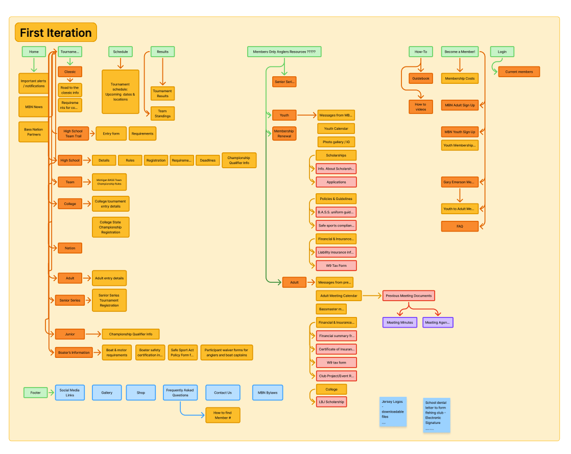
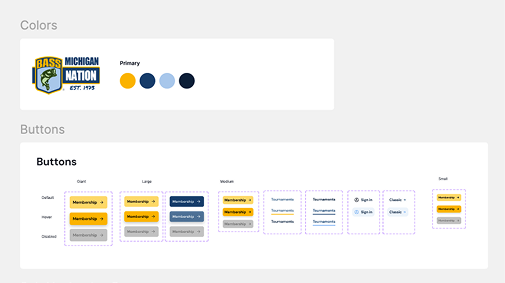
We created a design system based on the Michigan Bass Nation logo colors & typography, and focusing on a minimal design that is easy to scan and navigate. We then moved on to designing an initial prototype in Figma once the site map was approved by stakeholders.
After a prototype was created, we conducted a usability test with both the adult & youth program directors. We had them complete the following tasks:
After each task, participants completed a brief questionnaire to rate its difficulty. Once all tasks were finished, we conducted a post-study interview to gather deeper insights into what users found helpful and what they would improve.
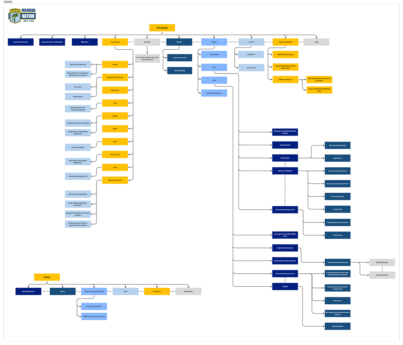
We created several design iterations based off of insights from the usability tests.
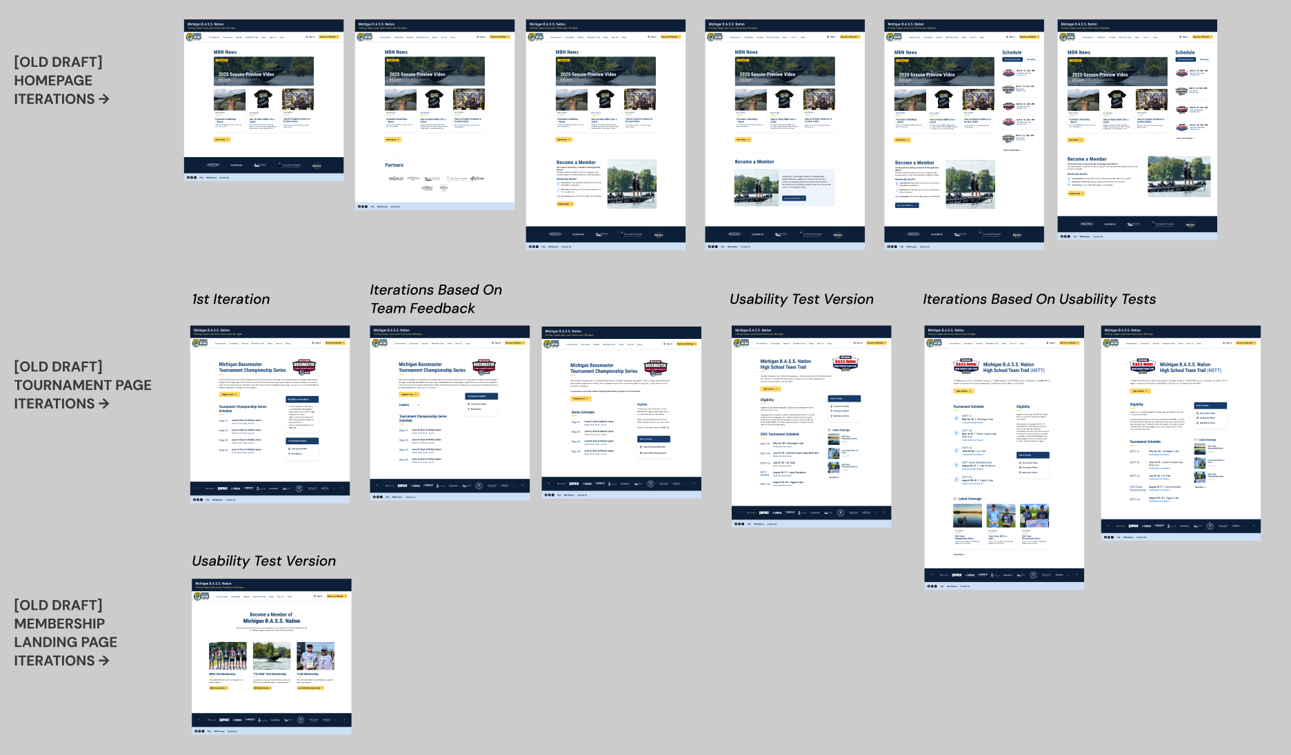
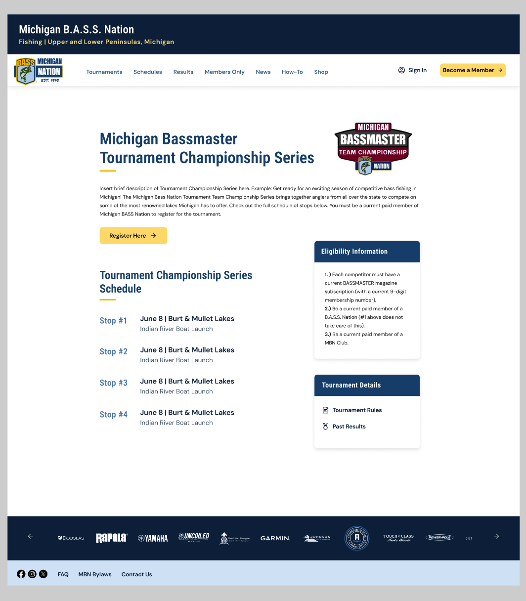
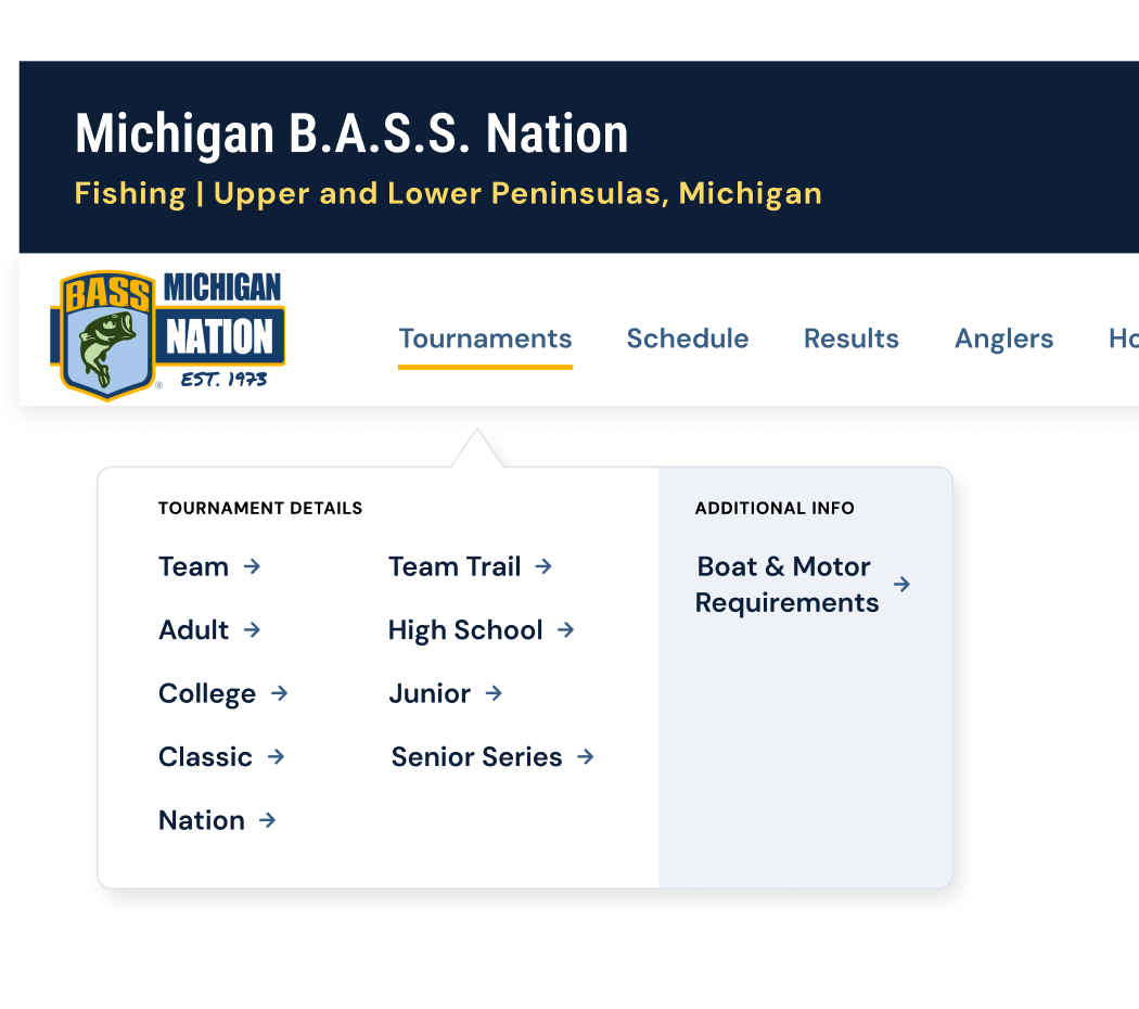
1st iteration of tournament page
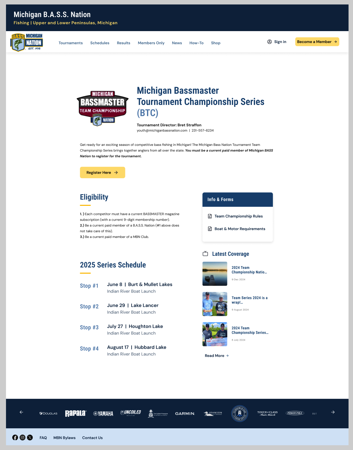
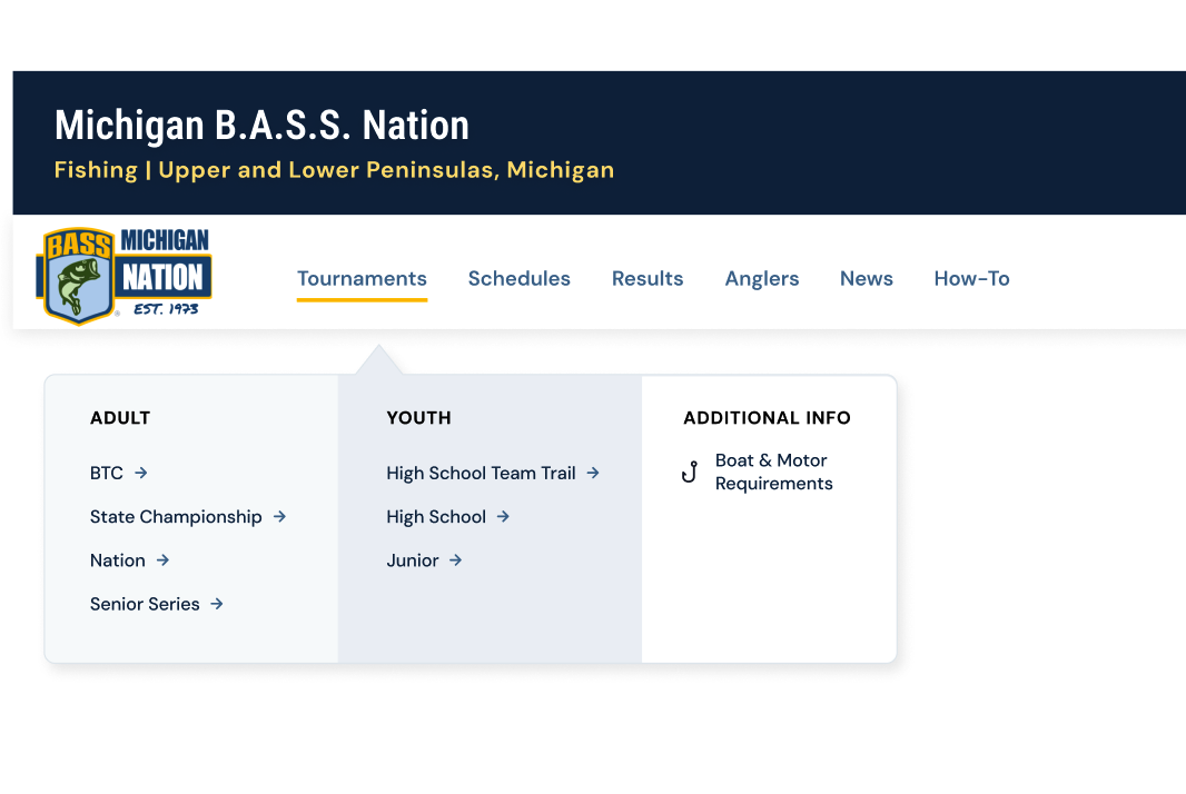
2nd iteration after usability testing
1st iteration of navigation bar
2nd iteration after usability testing
We finalized our Figma prototype and made plans to hand it off to a team to develop on a backend-friendly platform.
This project helped me grow as a UX designer and showed how important it is to base design decisions on real user feedback and testing. Working with a team improved how I share ideas, give and receive feedback, and stay focused on both user needs and the goals of the organization. Overall, it gave me more confidence in creating clear, user-friendly design solutions.